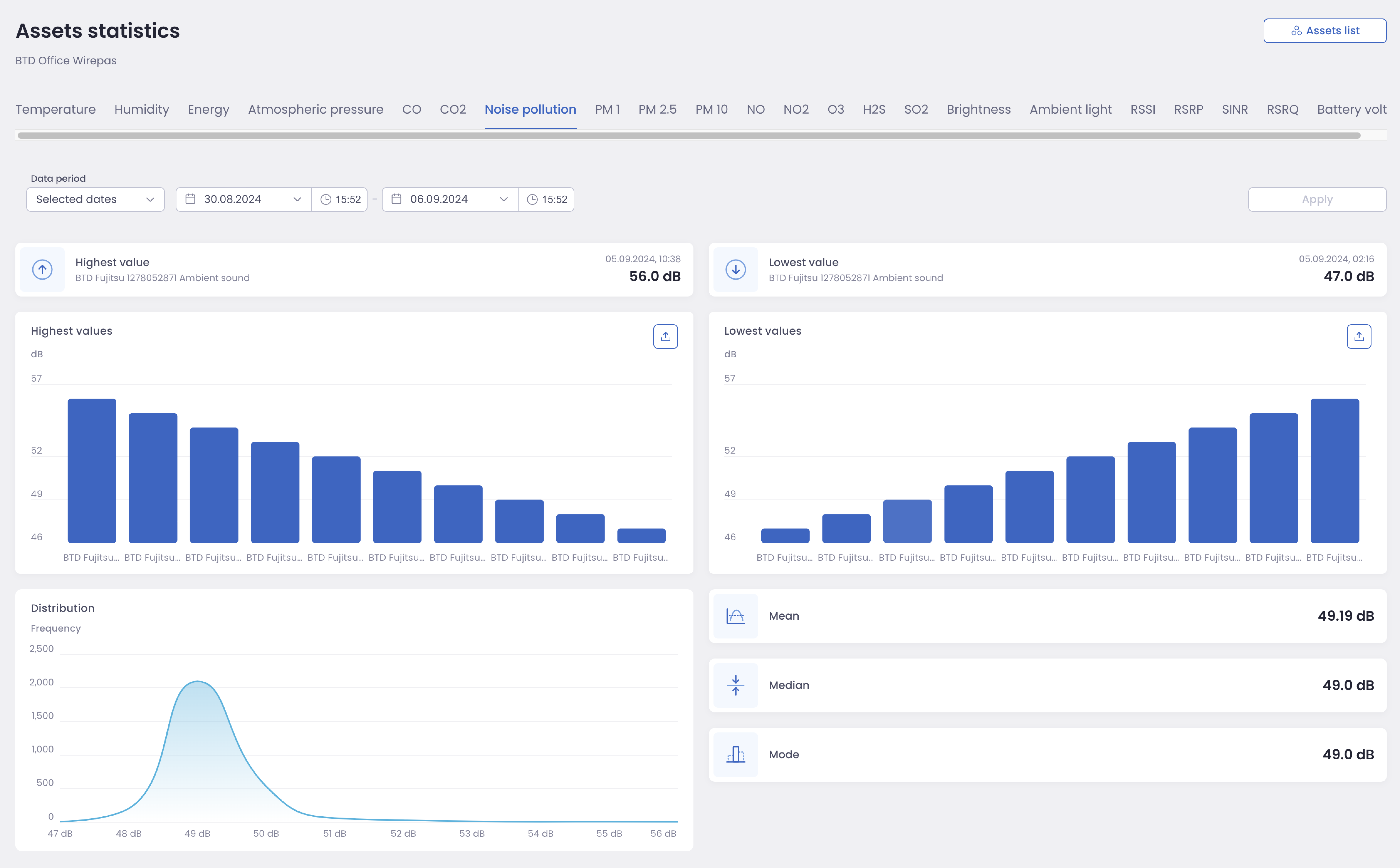
Asset Statistics Dashboard
The Asset Statistics Dashboard provides a comprehensive overview of collected data, summarized by Capability. It offers key statistical insights and visualizations to help you understand data distribution and identify trends.
Dashboard Features
Key Metrics:
Highest Recorded Value: Displays the peak value recorded, along with the corresponding device.
Lowest Recorded Value: Displays the minimum value recorded, along with the corresponding device.
Visualizations:
Top 10 Highest Values: A bar graph visualizing the ten highest recorded values.
Top 10 Lowest Values: A bar graph visualizing the ten lowest recorded values.
Data Distribution: A line graph of the overall data distribution, allowing for quick identification of patterns and outliers.
Statistical Calculations:
Mean: The mean of all collected values.
Median: The middle value in the sorted dataset.
Mode: The most frequently occurring value.
Filtering and Customization
Capability Selection: Easily switch between different capabilities using the tabs at the top of the page.
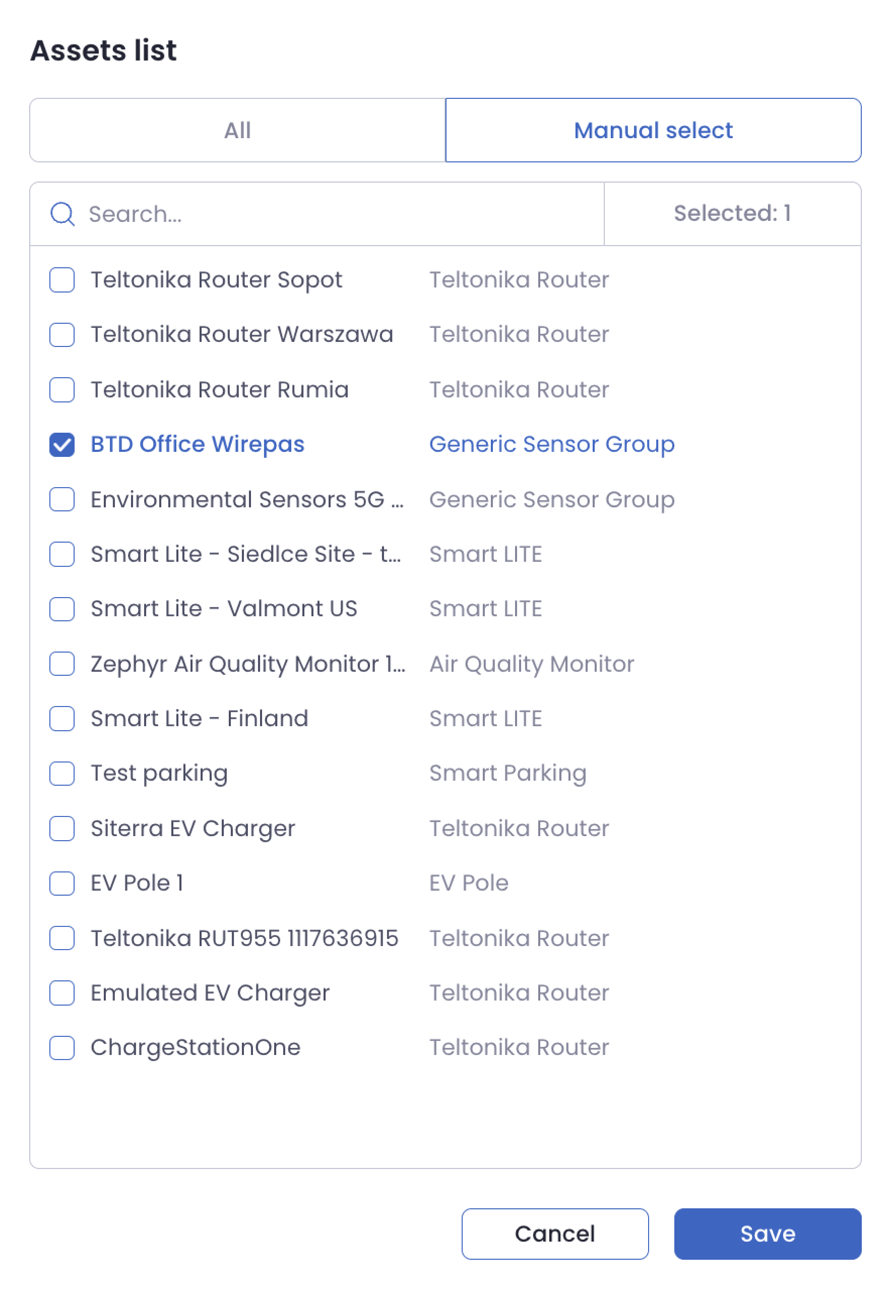
Asset Filtering: Refine your view by selecting specific assets using the “Asset List” button in the top-right corner.
Timeframe Selection: Adjust the data period to analyze specific time ranges by choosing predefined time ranges or manually select needed time range with the date and time picker for start and end under Data period.
Data Export: Export data as the Excel file from the highest and lowest value bar graphs for further analysis.
Example Use Case
Imagine you’re monitoring noise pollution levels across a city. The Asset Statistics Dashboard allows you to quickly identify the areas with the highest and lowest noise levels, view trends over time, and pinpoint specific devices reporting unusual readings.